
The What:
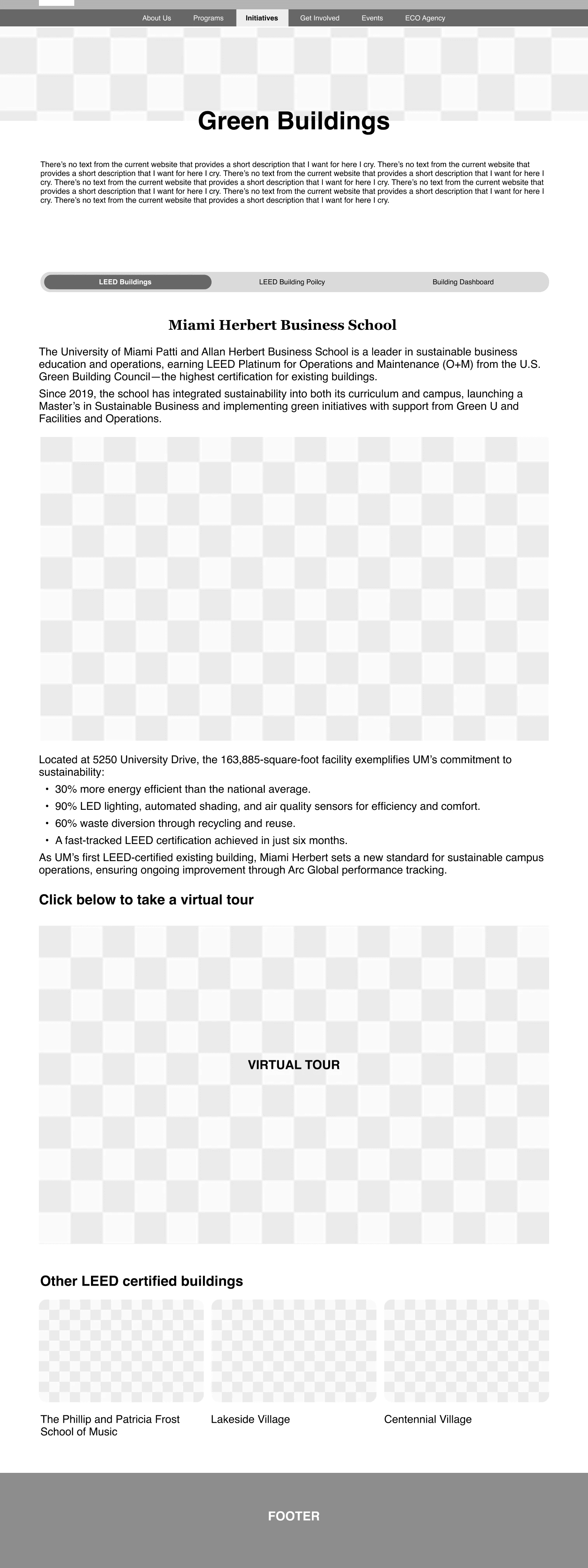
Green Buildings is a section under the University of Miami’s Sustainability website. It highlights LEED-certified campus buildings, featuring a virtual tour, sustainability dashboards, design policies, and key green features.
The Why:
With the university’s Sustainable Operations Plan 2035 underway, more buildings are being added. Despite currently showcasing only five buildings (soon to be six), the section already suffers from poor structure, inconsistency, and limited scalability.
The How:
To address these issues, we conducted a comprehensive UX audit across desktop and mobile, identifying key pain points in navigation and content structure. We analyzed best practices from peer institutions like Harvard and MIT to inform our approach. The redesign introduced a clean, mobile-friendly layout, improved content hierarchy, and an interactive virtual tour of Centennial Village. I also developed a UI kit to ensure visual consistency and scalability as more buildings are added.
Imagine you’re a prospective student passionate about sustainability and exploring schools that align with your values. You visit the University of Miami’s website, expecting to learn how sustainability shows up on campus.


For a student looking for signs of commitment to sustainability, this lack of consistency sends the wrong message. And with more buildings about to be added, the problem is not just what exists now. Each new update risks adding to the confusion. Before the site could grow, its foundation needed to be fixed.
To fix the problem, we knew we couldn’t just patch up a few pages; we had to step back and look at the entire site. We ran a full audit of the Green Buildings section, and the issues quickly revealed themselves.

Hard to navigate, with key pages buried under inconsistent sections.

With a clearer sitemap in place, the next step was to bring that structure to life on the page. As the UX lead, I began sketching layout concepts that would reflect the new information hierarchy while addressing usability pain points. I started with quick layouts in sketch.
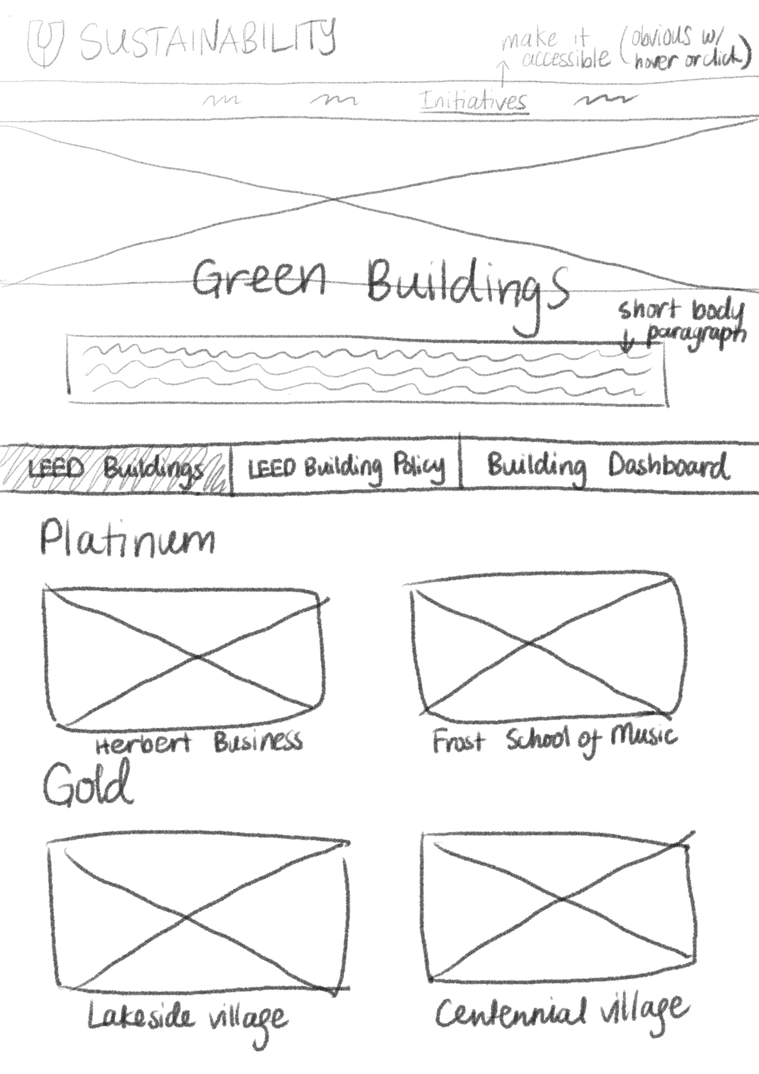
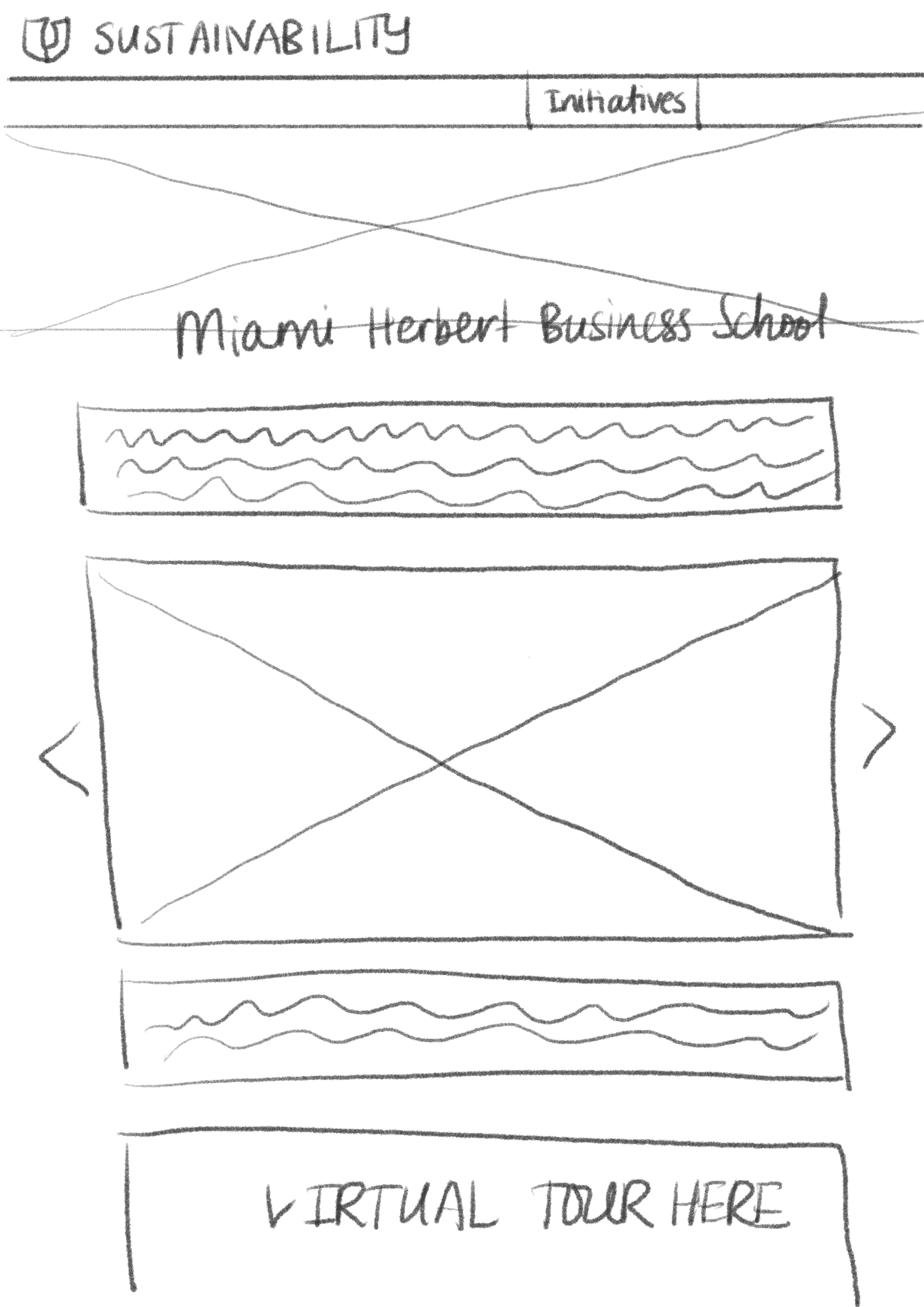

I then refined them into mid-fidelity wireframes. During this stage, I also rewrote and reorganized much of the site’s existing text; clarifying labels, simplifying language, and ensuring content aligned with user needs. Every layout decision, from spacing to typography, was made with user clarity in mind. The goal was to create a foundation that not only looked clean, but helped users find what they needed faster and with less effort.


Easy Navigation
I proposed reducing the navigation from five categories to three to cut down on confusion and repeated content. With a single horizontal menu, users can now easily switch between sections without cognitive overload. This streamlined structure made the experience more intuitive and future-proof.

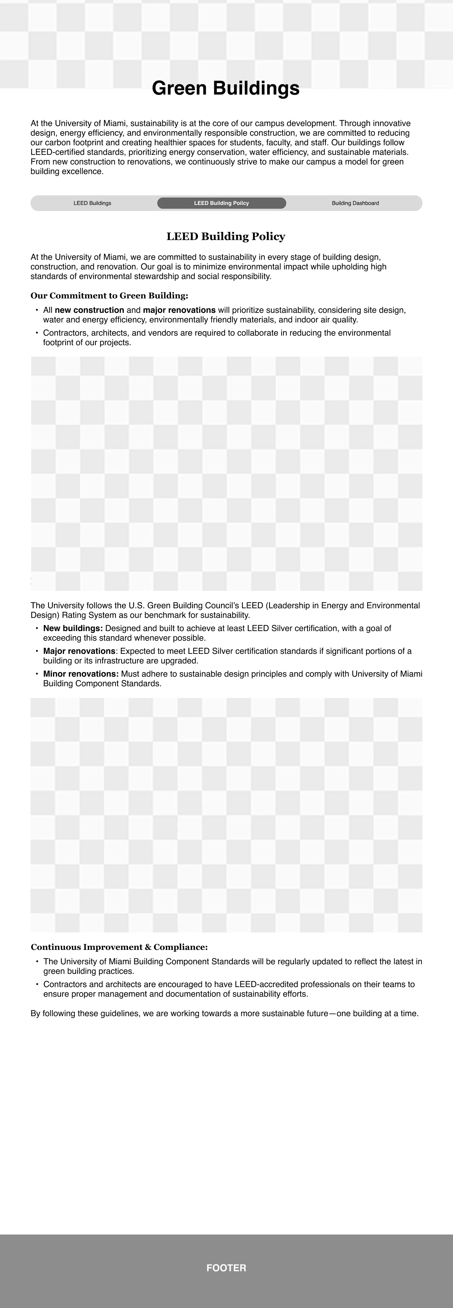
Smarter Content Structure
Content is now organized by certification type, making it easier for users to understand how buildings are categorized. Instead of using expandable toggles, users can click directly on building images to explore more; creating a more intuitive and visually engaging experience.
A New Feature to Encourage Discovery
Content is now organized by certification type, making it easier for users to understand how buildings are categorized. Instead of using expandable toggles, users can click directly on building images to explore more—creating a more intuitive and visually engaging experience.